FamilySearch
Project Type: Internship Project
Duration: 1.5 months
Role: UX Designer & Researcher
Methods: User Interviews, A/B Testing, Prototyping, Usability Testing
// CONTEXT
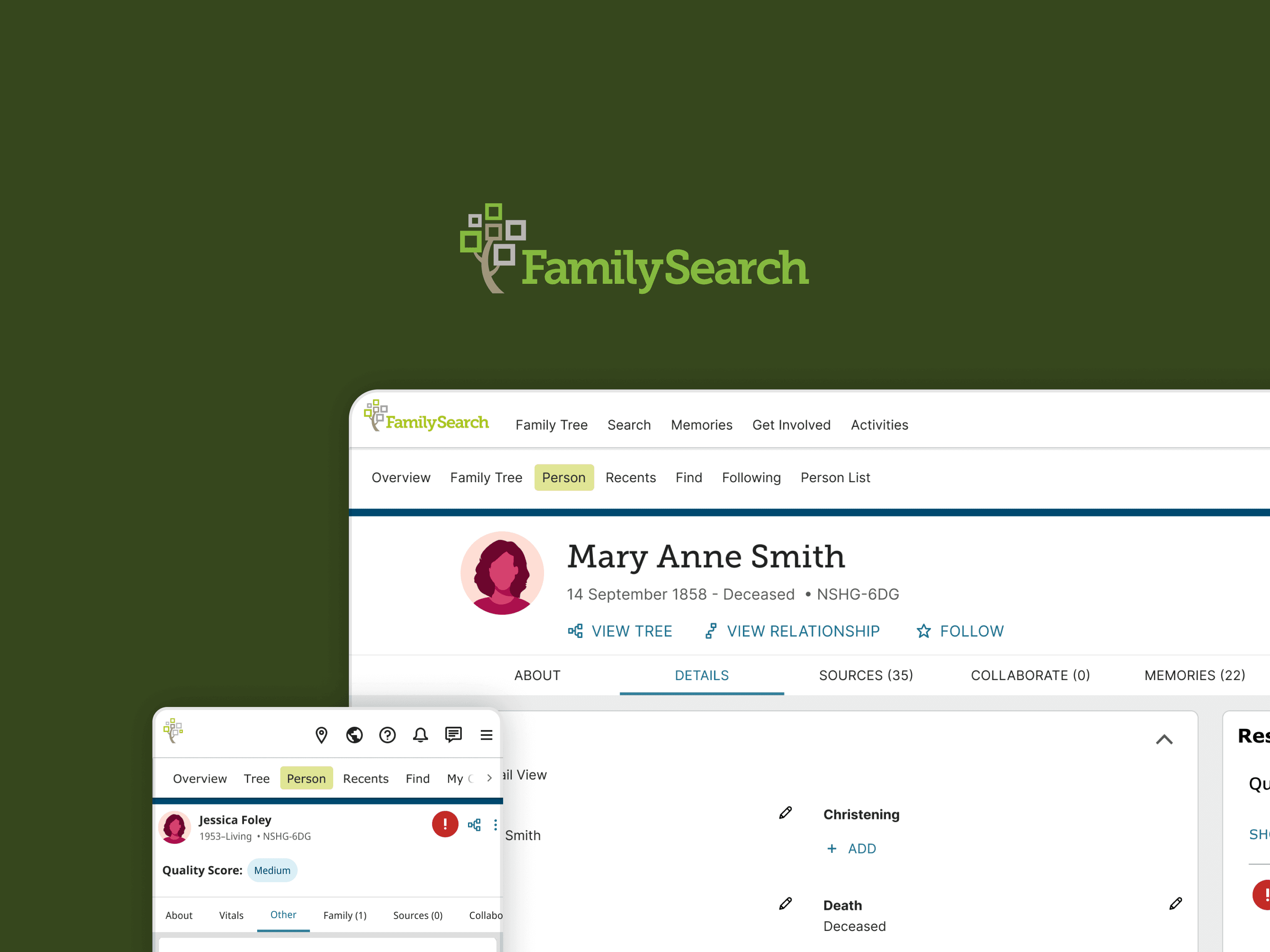
FamilySearch (Data Quality Score)
FamilySearch’s Family Tree platform helps users preserve and explore their family history. As part of an effort to improve data quality and user trust, the team introduced a Data Quality Score. It's a feature that flags inconsistencies and suggests areas for improvement in the family tree. My task was to redesign this tool for clarity, trust, and usability.
// PROBLEM
Data Quality Issues Were Undermining Trust
Many FamilySearch users encountered inaccurate or conflicting data in their family trees but had little guidance on what needed attention or how to resolve issues. Although an algorithm had been developed to detect such inconsistencies, the early design of the score interface lacked clarity, urgency, and guidance.
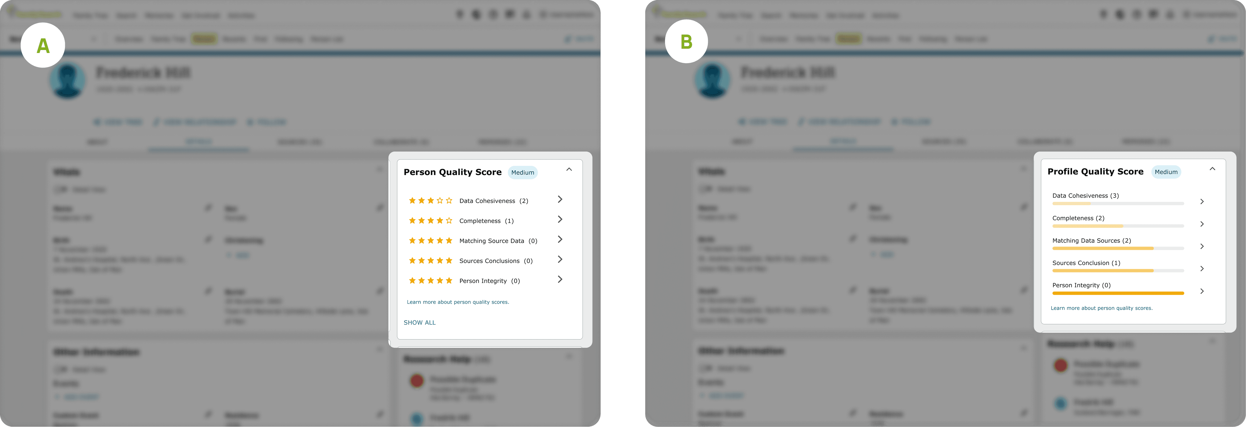
Key Pain Points Identified via A/B Testing & User Feedback
Through A/B testing and user interviews, we discovered key usability issues:
Unclear iconography: Users didn’t understand what the icons meant or what action they implied.
Low urgency and trust: The score didn't convey the importance of addressing issues.
Poor interpretability: Users struggled to understand how their score was calculated or how to improve it.
// SOLUTION
Designing a Solution
Design a Tool That Promotes Understanding and Action
Our goal was to reimagine the Data Quality Score tool to build trust and drive user engagement by making the issues clear, actionable, and digestible.
Strategic UX Objectives:
Simplify the score display and error presentation
Reduce cognitive load through improved visual hierarchy
Create urgency and clarity around data improvements
Iterating Till Success
1st Iteration:

Points of Failure:
Too much mental load
Lack of familiarity
Confusing navigation
Final Iteration
Key Feature 1: Clarified Quality Score Summary
Problem | Solution | How |
|---|---|---|
Users struggled to understand what the Data Quality Score meant or how to act on it. | Clarify the score’s purpose and how to interpret it. | Reorganised layout: Issues were grouped and prioritised for easier scanning Collapsible details: Sections could be expanded or collapsed to suit user preference Clearer labels and icons: New visual language clarified types of data issues |

Key Feature 2: Clarified Quality Score Info Sheet
Problem | Solution | How |
|---|---|---|
Confusions:
| Redesigning the Data Quality Score Experience:
|
|

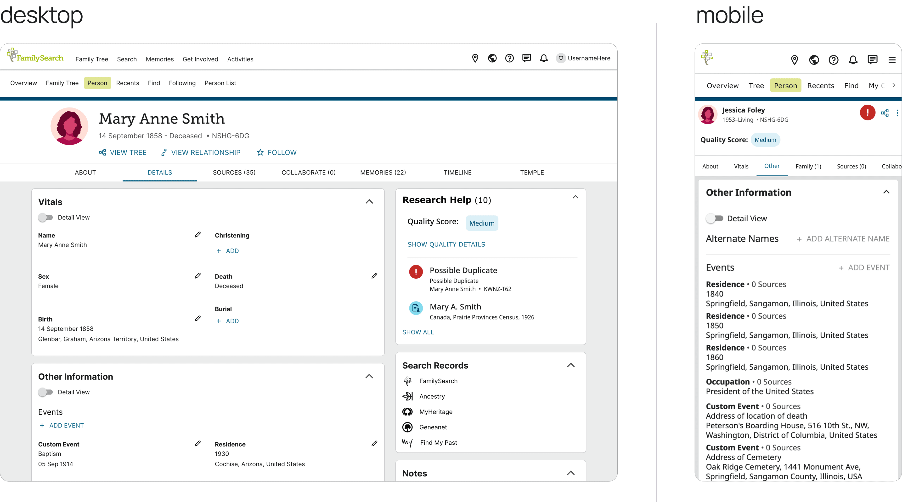
Key Feature 3: Mobile-First Optimisation
Problem | Solution | How |
|---|---|---|
Difficulty accessing or locating score information from various parts of the app. | Improve discoverability with multiple, logical access points. |
|

//CONTRIBUTIONS
My Role:
My task was to redesign this tool for clarity, trust, and usability. Here’s a breakdown of what I worked on:
User Research & Usability Tests
Conducted 3 rounds of user interviews to understand pain points and gather qualitative feedback
Ran A/B tests comparing new designs with the original
Iterated on prototypes based on user testing rounds
Cross-Functional Collaboration
Worked closely with developers and product managers to ensure designs met technical constraints and could be implemented with minimal performance trade-offs
//RESULTS
Outcome & Impacts
To measure long-term impact, the following metrics could be tracked:
Engagement rate: % of users interacting with the score and issue resolution features
Completion rate: % of users resolving flagged issues after viewing the score
Clarity ratings: User feedback scores around how well they understand the tool
Trust indicators: Survey-based trust metrics
// REFLECTIONS & LEARNINGS
What I learned
User Testing Rigour
Asking the right questions during testing unlocked more actionable feedback.
Systems Thinking
Gained insight into how design decisions can impact backend complexity and performance.
Design Adaptability
Learned to adjust design processes to fit evolving project goals and team priorities.
Relationship Sensitivity
Understood the emotional complexity of representing family relationships and how subtle design choices can build or break trust.