

Data Quality Score
A tool to measure the quality of data.
Duration:
1.5 months
Role (Internship):
UX-Design & Research
Methodologies:
Research, User Interviews, User Tests, Iteration, Prototyping
Summary
In-Depth
Overview
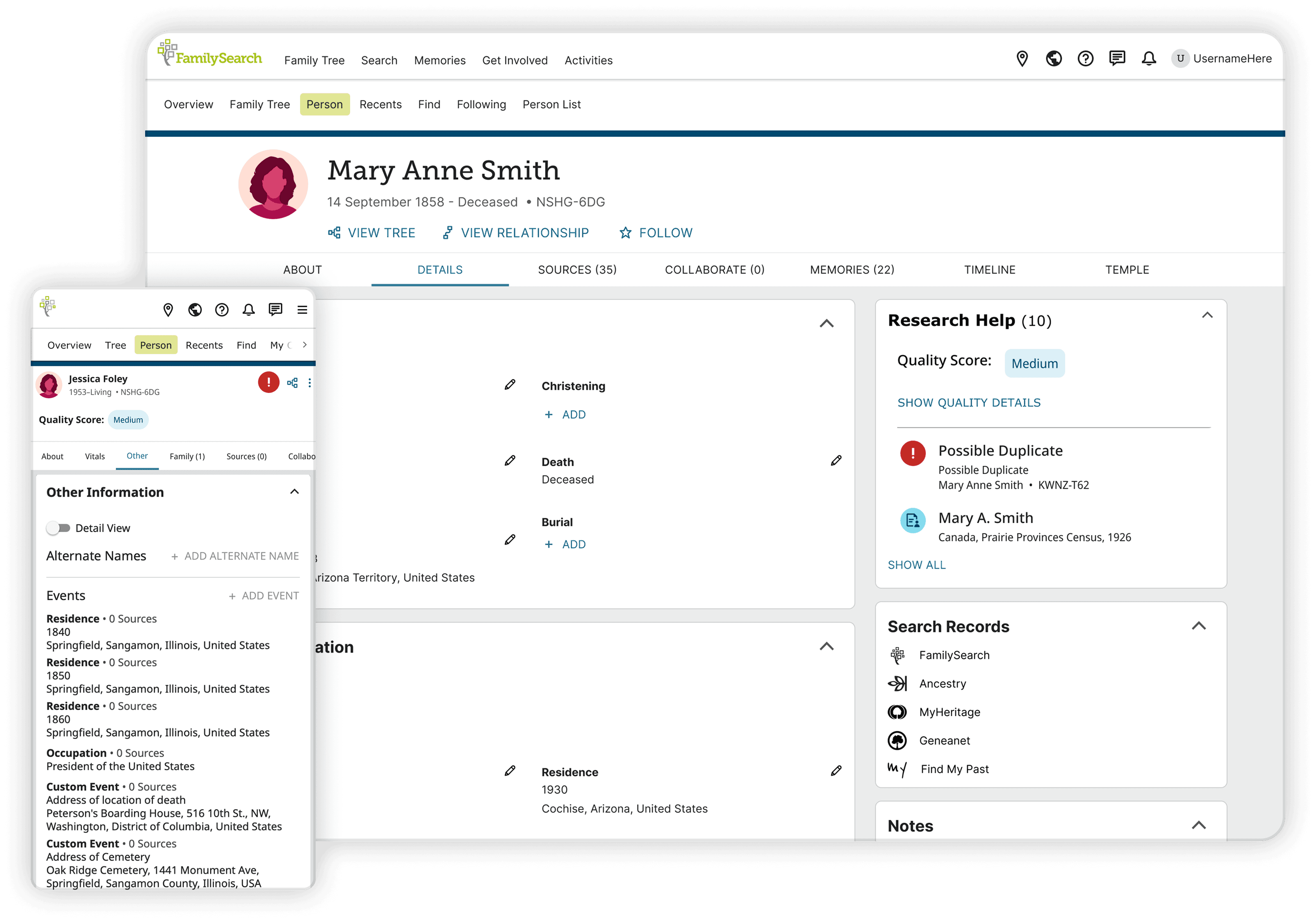
The Data Quality Score in Family Tree can give you confidence in the sources and information about your ancestors. It can help you find areas of improvement or signal errors and inconsistencies in your family tree.
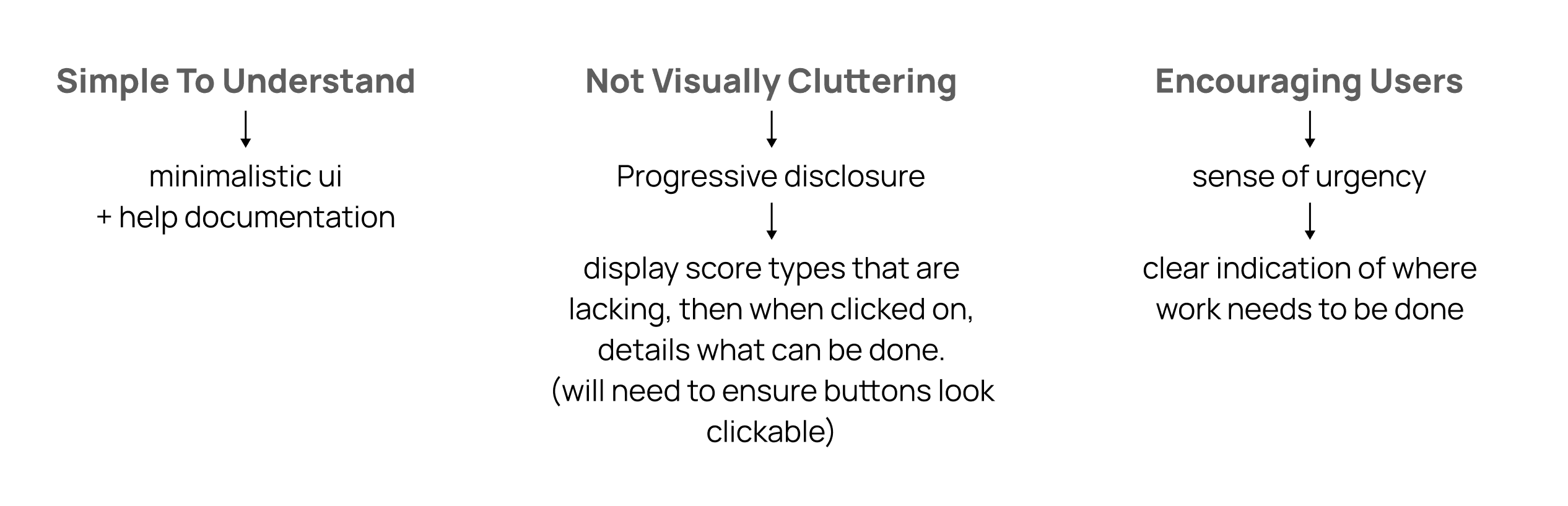
How Can We Help Users
How might we help users reduce inconsistencies and improve the accuracy of their family tree?
FamilySearch’s algorithms perform checks on data to highlight errors, inconsistencies, and areas for improvement.

How Can I Improve on Initial Drafts
I was tasked with improving the initial designs that were drafted before I joined.
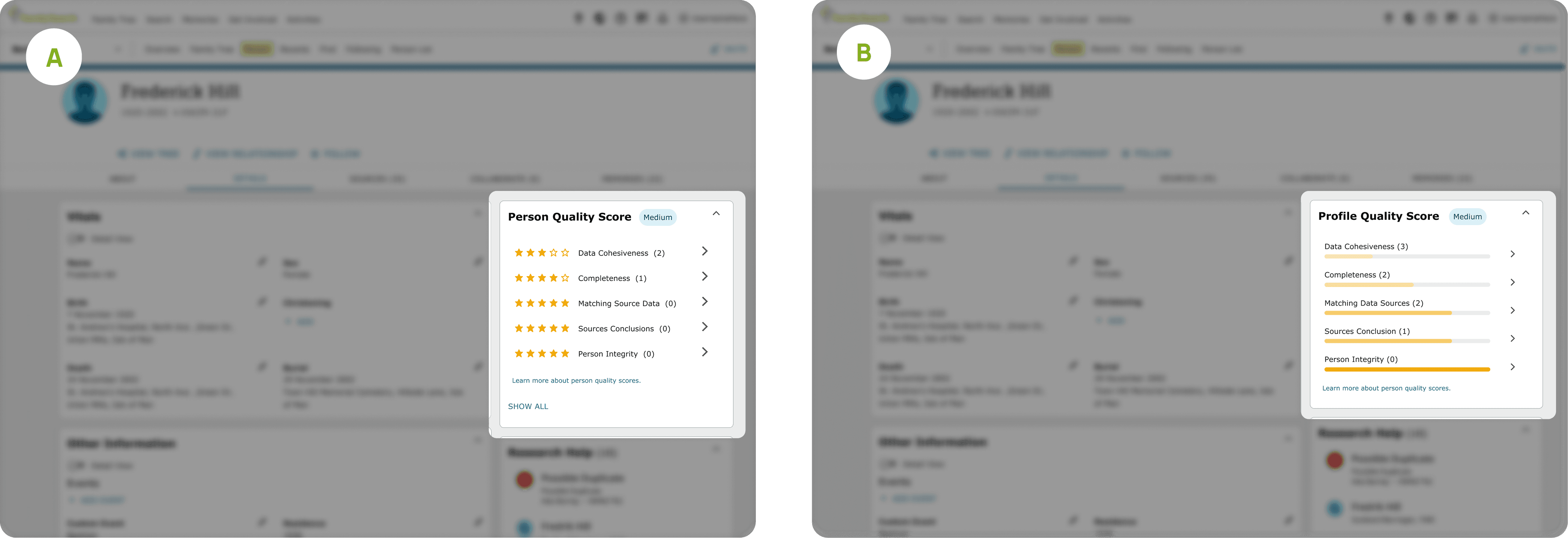
Identifying key issues through A/B Testing:
Unclear iconography
Lack of urgency & clarity
Difficulty interpreting scores
Jobs to be Done
Iterating Till Success
1st Iteration
Points of Failure:
Too much mental load
Lack of familiarity
Confusing navigation

Last Iteration
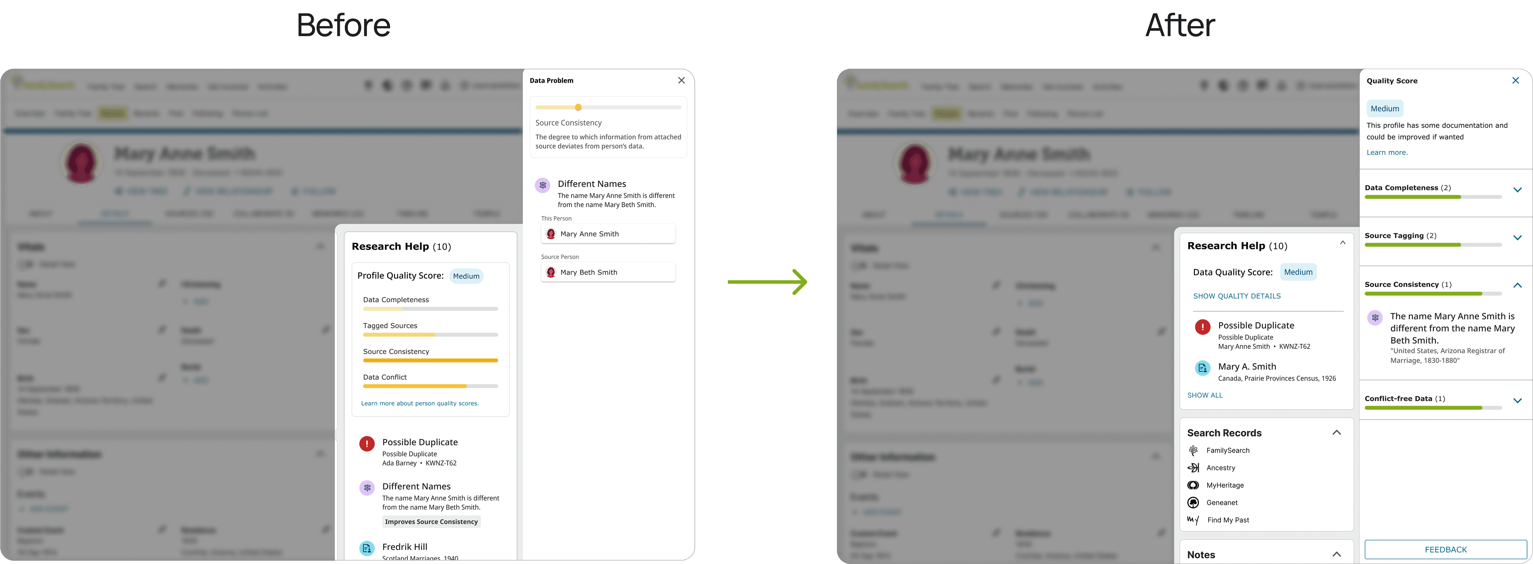
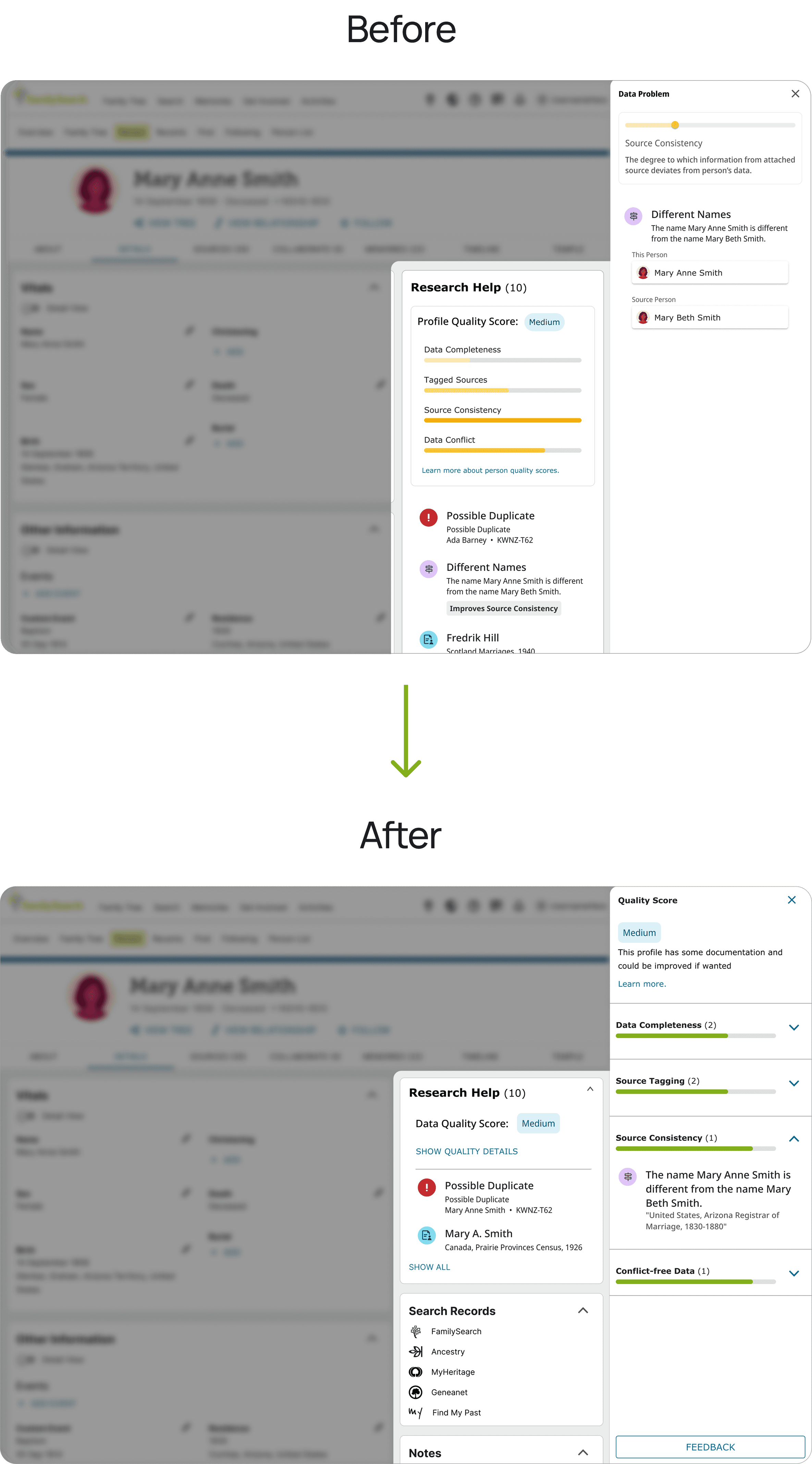
(1) Quality Score Summary:
Reorganized Quality Score Issues
Collapsible Score Details

(2) Quality Score Info Sheet:
Unified Side Sheet for All Issues
Score Bar Color Change
Issue Count Display
Enhanced Overview for Users

Balancing Mobile-First Design with System Constraints
(1) Person Page
Multiple Access Points for Quality Score
Maintaining Familiarity and Efficient Use of Space on Mobile
Enhancing Discoverability for New Users

(2) Info Sheet
Optimized Quality Score Display:
On desktop, the Quality Score details appear in a side sheet so that users can still view and reference the main screen while assessing issues.
On mobile, a full sheet is used instead of a bottom sheet.

Outcomes
Impacts
Surfaced critical data errors for users: Designed a user-friendly interface that communicates potential profile issues—such as age inconsistencies or duplicate entries—helping users make more informed edits.
Enhanced trust in FamilySearch's data: By making data checks visible and actionable, users gained more transparency into the data-cleanup process.
Supported more accurate family records: The new UI encourages proactive corrections, which contributes to higher overall data quality across the platform.
Aligned UI design with backend logic: Bridged the gap between complex algorithm outputs and user interpretation, ensuring the interface supports meaningful engagement with the data.
Defining Success: Metrics I’d Use
While I didn’t have access to analytics during this project, here’s how I would evaluate the success of the design:
Accuracy improvement over time: Measure changes in error frequency or duplicated records in trees where the UI was deployed.
Resolution rates & User engagement with alerts: Monitor interactions with the alert components—clicks, dismissals, edits initiated from the alerts, or success resolves.
User understanding and satisfaction: In the process of continuous discovery, run surveys or usability tests to assess whether users understand the purpose of the alerts and feel empowered to act on them.
Decrease in support tickets related to incorrect data: Evaluate whether user-facing alerts reduce confusion and related help requests.
What Did I Learn?
Learned Insights
User Testing Skills:
Asking the right questions is crucial in helping a designer gather useful and appropriate feedback for development.
Adaptability:
One needs to be able to adapt their design thinking processes to fit the needs and goal of each project.
Critical Evaluation Skills:
The method of critically evaluating and reflecting on user feedback can be pivotal in the product development.
Cost of design decisions on backend:
Deeper insight to how design decisions can impact the cost on backend.
Complexities of real-life relationships in interface design:
This project highlighted the intricacies of relationships that can exist within a family and it's hidden dangers.
Summary
In-Depth
Overview
The Data Quality Score in Family Tree can give you confidence in the sources and information about your ancestors. It can help you find areas of improvement or signal errors and inconsistencies in your family tree.
How Can We Help Users
How might we help users reduce inconsistencies and improve the accuracy of their family tree?
FamilySearch’s algorithms perform checks on data to highlight errors, inconsistencies, and areas for improvement.
How Can I Improve on Initial Drafts
I was tasked with improving the initial designs that were drafted before I joined.
Identifying key issues through A/B Testing:
Unclear iconography
Lack of urgency & clarity
Difficulty interpreting scores
Jobs to be Done
Iterating Till Success
1st Iteration
Points of Failure:
Too much mental load
Lack of familiarity
Confusing navigation
Last Iteration
(1) Quality Score Summary:
Reorganized Quality Score Issues
Collapsible Score Details
(2) Quality Score Info Sheet:
Unified Side Sheet for All Issues
Score Bar Color Change
Issue Count Display
Enhanced Overview for Users
Balancing Mobile-First Design with System Constraints
(1) Person Page
Multiple Access Points for Quality Score
Maintaining Familiarity and Efficient Use of Space on Mobile
Enhancing Discoverability for New Users
(2) Info Sheet
Optimized Quality Score Display:
On desktop, the Quality Score details appear in a side sheet so that users can still view and reference the main screen while assessing issues.
On mobile, a full sheet is used instead of a bottom sheet.
Outcomes
Impacts
Surfaced critical data errors for users: Designed a user-friendly interface that communicates potential profile issues—such as age inconsistencies or duplicate entries—helping users make more informed edits.
Enhanced trust in FamilySearch's data: By making data checks visible and actionable, users gained more transparency into the data-cleanup process.
Supported more accurate family records: The new UI encourages proactive corrections, which contributes to higher overall data quality across the platform.
Aligned UI design with backend logic: Bridged the gap between complex algorithm outputs and user interpretation, ensuring the interface supports meaningful engagement with the data.
Defining Success: Metrics I’d Use
While I didn’t have access to analytics during this project, here’s how I would evaluate the success of the design:
Accuracy improvement over time: Measure changes in error frequency or duplicated records in trees where the UI was deployed.
Resolution rates & User engagement with alerts: Monitor interactions with the alert components—clicks, dismissals, edits initiated from the alerts, or success resolves.
User understanding and satisfaction: In the process of continuous discovery, run surveys or usability tests to assess whether users understand the purpose of the alerts and feel empowered to act on them.
Decrease in support tickets related to incorrect data: Evaluate whether user-facing alerts reduce confusion and related help requests.
What Did I Learn?
Learned Insights
User Testing Skills:
Asking the right questions is crucial in helping a designer gather useful and appropriate feedback for development.
Adaptability:
One needs to be able to adapt their design thinking processes to fit the needs and goal of each project.
Critical Evaluation Skills:
The method of critically evaluating and reflecting on user feedback can be pivotal in the product development.
Cost of design decisions on backend:
Deeper insight to how design decisions can impact the cost on backend.
Complexities of real-life relationships in interface design:
This project highlighted the intricacies of relationships that can exist within a family and it's hidden dangers.
FamilySearch Project
Olive Yuen